To mark the 400th anniversary of the First Folio, Shakespeare’s Globe has launched a custom typeface called Amifer Folio. The project transforms intricate woodcut illustrations from the 17th-century collection into a functional branding tool for the theater's upcoming summer shows.
Translating 17th-Century Woodcuts to Modern Type
The project was initiated by the theater's in-house design team to revisit the First Folio, a collection printed seven years after Shakespeare's death. They selected specific ornamental editorial devices from the original text, which were historically used as illustrative markers to separate sections of prose.
Working with south London type design studio Typeland, the team reworked these elements to establish a base thematic treatment. This process culminated in the creation of a bespoke layer font that preserves the aesthetic of the original woodcuts while functioning as a modern typeface.
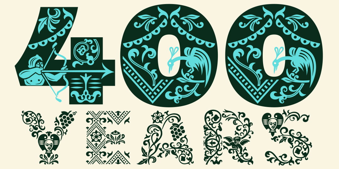
This visual demonstrates the ornate, decorative style of the typeface and its thematic connection to the 400th anniversary.
“The woodcut illustrations serve as a perfect reminder of the fragility and beauty of the natural world – not only visually, but also in their scarcity, as they only exist in fewer than 200 remaining copies of the Folio”
— Shakespeare’s Globe unveils typeface using intricate designs from playwright’s First Folio
Scalability and Character Design
A primary challenge of the project was ensuring that the intricate designs remained effective at varying sizes. To solve this, the Amifer Folio family was split into two separate styles: Amifer Folio Small and Amifer Folio Big.
The Small version provides a simplified aesthetic for smaller applications, while the Big version contains a greater number of elements and fills to provide a more impactful presence at larger scales. Each style incorporates a 'peculiar cast of characters' derived from the Folio's woodcuts, featuring figures like demons, angels, and gargoyles.
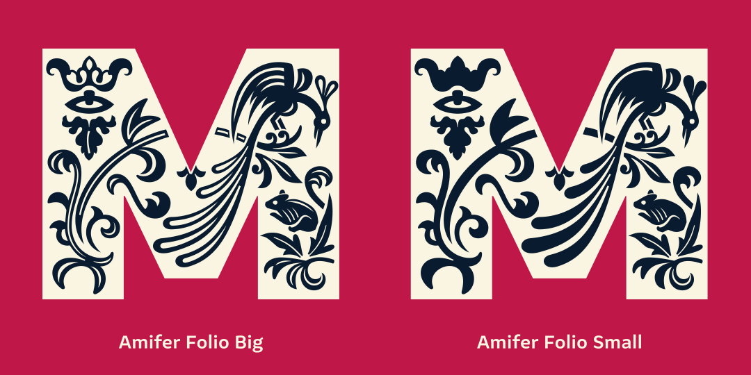
This image illustrates the specific design distinction between the Small and Big versions of the typeface described in the article.
Branding and Thematic Context
The typeface will be featured prominently on posters for the new summer season. These designs are intended to reflect a theme of 'wilderness and tamed environments,' a concept explored by artistic director Michelle Terry and the play directors.
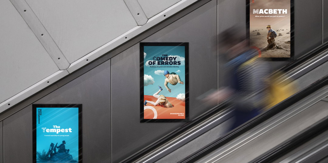
This photo provides context for how the typeface will be applied to the theater's physical branding and promotional materials.
The woodcut illustrations were chosen specifically because they highlight the fragility and beauty of the natural world. Because fewer than 200 copies of the Folio remain, the project also serves as a tribute to the scarcity and historical significance of the original 17th-century text.