A digital archive hosted by symbools.com has begun preserving the visual history of corporate identity by digitizing Yasaburo Kuwayama’s 1973 publication, 'Trademarks & Symbols, Volume 2: Symbolical Designs.' The project captures 1,504 distinct marks, ranging from human figures and birds to arrows and hiragana characters. These designs represent the work of 725 different designers and 1,142 companies across 30 countries, providing a comprehensive snapshot of how visual identities were constructed in the early 1970s.
This image provides a concrete example of the diverse and expressive corporate branding from the 1973 era.
The original book by Kuwayama, published by Van Nostrand Reinhold, is structured not just as a gallery but as a study of the mechanics of branding. It includes three essays exploring how marks evolve over time, the criteria for distinguishing between two similar marks, and the processes by which competitions choose winning designs. The current archive reflects this diversity, showcasing marks such as stylized human figures built from angular bars or plump birds with hollow bodies. These examples illustrate a period of graphic design that prioritized unique, often complex, symbolical representations for corporate entities.

This image illustrates the stylized human figures built from angular bars mentioned in the second paragraph.

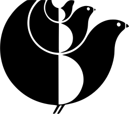
This image serves as a specific example of the plump birds with hollow bodies described in the archive's diversity.
While the archive serves as a historical benchmark, it also highlights a shift in modern design aesthetics. Observers of the collection note a contrast with contemporary branding, which has trended toward homogenization and minimalism. Unlike the varied and expressive marks of the 1973 collection, many modern logos are criticized for lacking distinctiveness, often resulting in a more uniform visual language across different industries. Additionally, because the archive is a work in progress based on scanned copies of the original book, some edges and details may not perfectly match the original artwork, as the marks are being polished and traced one at a time.