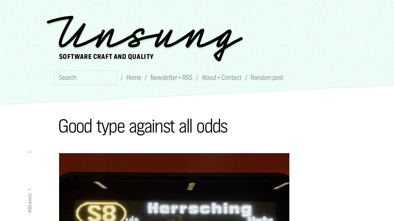
In his exploration of software craft and typography, Marcin Wichary highlights how the appearance of text is often a byproduct of the underlying hardware's mechanics. A primary example is the 'slanted' appearance of italics on certain digital displays. Wichary explains that this is frequently a side effect of how displays are updated line by line from top to bottom. As the internal horizontal position advances during this process, subsequent lines may be drawn slightly to the left, creating a slanted look similar to the 'rolling shutter' effect in photography.
While the right-leaning slant of English and German italics is customary, Wichary notes that the direction could have been reversed by choosing to update the display from bottom to top or by scrolling to the right. These choices—whether intentional design decisions or default hardware behaviors—illustrate how 'craft' can sometimes be achieved for free if the right technical path is chosen. This distinction between intentionality and default behavior is a recurring theme in the analysis of how software interacts with physical constraints.
Beyond digital displays, Wichary showcases several examples of intentional craftsmanship in physical objects. These include a stadium icon that cleverly utilizes the limitations of a 5x7 pixel font display, and a vertical ligature on a physical product where line height was removed to carve letters into plastic. Other examples include a three-dimensional underline on an old typesetting machine and the inclusion of old-fashioned contractions on a computer keyboard. These instances serve as evidence of how designers can navigate technical limitations to create 'delightful' moments of elegance in otherwise mundane interfaces and hardware.