Apple has officially pivoted away from a recent UI trend in macOS. Following the release of macOS Tahoe, which introduced icons into every menu item by default, the company has shifted its approach in the newer Golden Gate release. This change is significant because it marks a public reversal of a design choice that had been implemented and lived with for a year. According to Jim Nielsen, this shift is more than just a stylistic choice; it represents a move back toward established Human Interface Guidelines (HIG) that Apple itself had previously deviated from.
The primary mechanism behind this shift involves the reduction of visual noise. In macOS Tahoe, the inclusion of icons in every menu item was criticized for creating a cluttered interface. By removing these icons by default, Apple is returning to a model where icons are reserved for menu items that provide significant added value. This aligns with older documentation from the company, which suggests that over-using icons can make a menu harder to read. The move highlights a transition from a 'maximalist' visual approach—potentially driven by a desire for higher interaction metrics—back toward a more functional, text-centric navigation system.
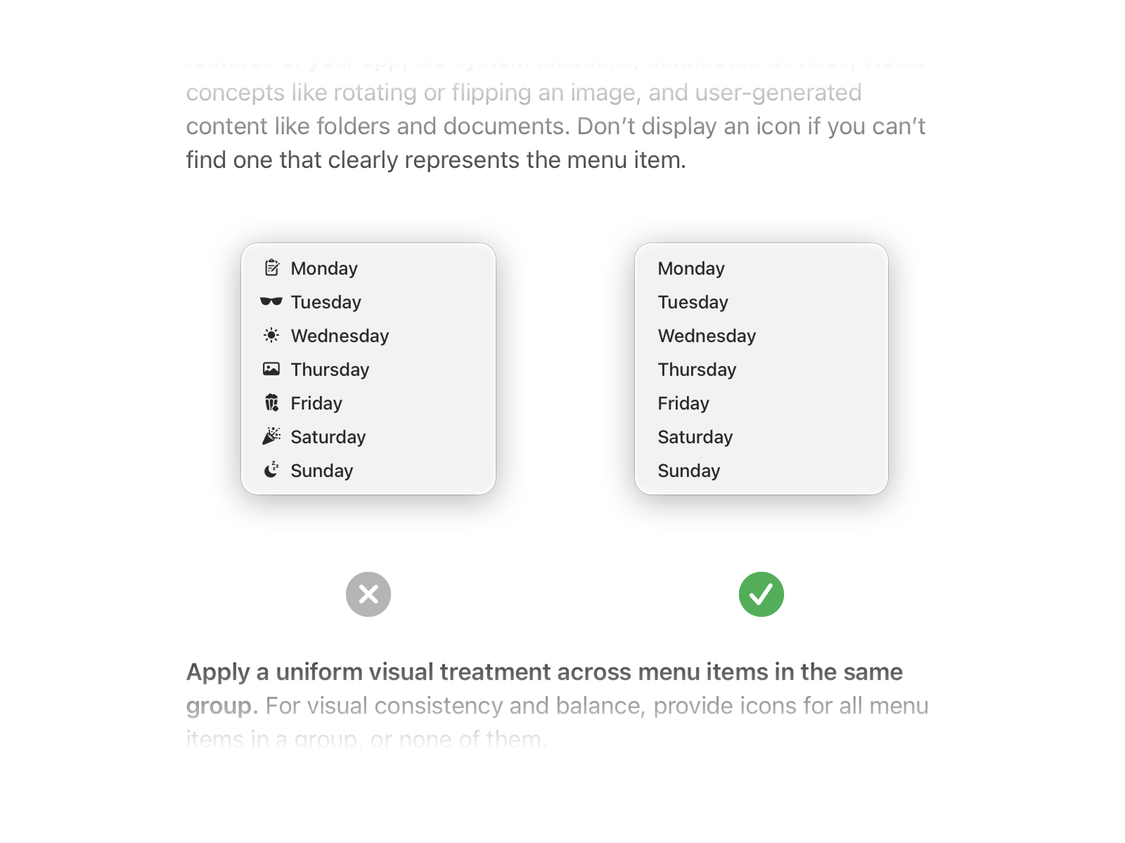
This image illustrates the design shift from the maximalist icon-heavy menus of Tahoe back to the functional navigation of Golden Gate.
Discussion surrounding this change reveals a divide in how UI evolution is perceived. Some observers attribute the shift to a generational turnover in design teams, suggesting that newer designers may lack the historical context of why certain 'old' principles, like high-density text menus, were originally established. Others point to the practical difficulties of icon-heavy designs, noting that icons can become ambiguous or confusing when they lack clear tooltips or unique shapes. While some argue that icons are essential for accessibility for users with different needs, the consensus among many critics is that the current trend toward uniform, 'liquid' shapes for icons often sacrifices distinctiveness for aesthetic consistency, ultimately making the interface less intuitive for the average user.