Foldable phones and dual-screen devices like the Surface Duo present a layout problem that ordinary responsive design does not solve: the browser window can span two physically separate displays divided by a hinge or fold. A page laid out for one continuous rectangle can end up with content split awkwardly across the seam, or hidden behind the hinge.
Two CSS features let a page detect that situation and adapt. The first is a pair of media queries:
@media (horizontal-viewport-segments: 2) { /* held like a book, two screens side by side */ } @media (vertical-viewport-segments: 2) { /* stacked like a laptop, fold horizontal */ }
`horizontal-viewport-segments` matches the device when the hinge is vertical and the two screens sit side by side; `vertical-viewport-segments` matches when the hinge is horizontal and the screens are stacked. The integer reports how many viewports exist in that direction, so a page can target exactly the two-screen posture.
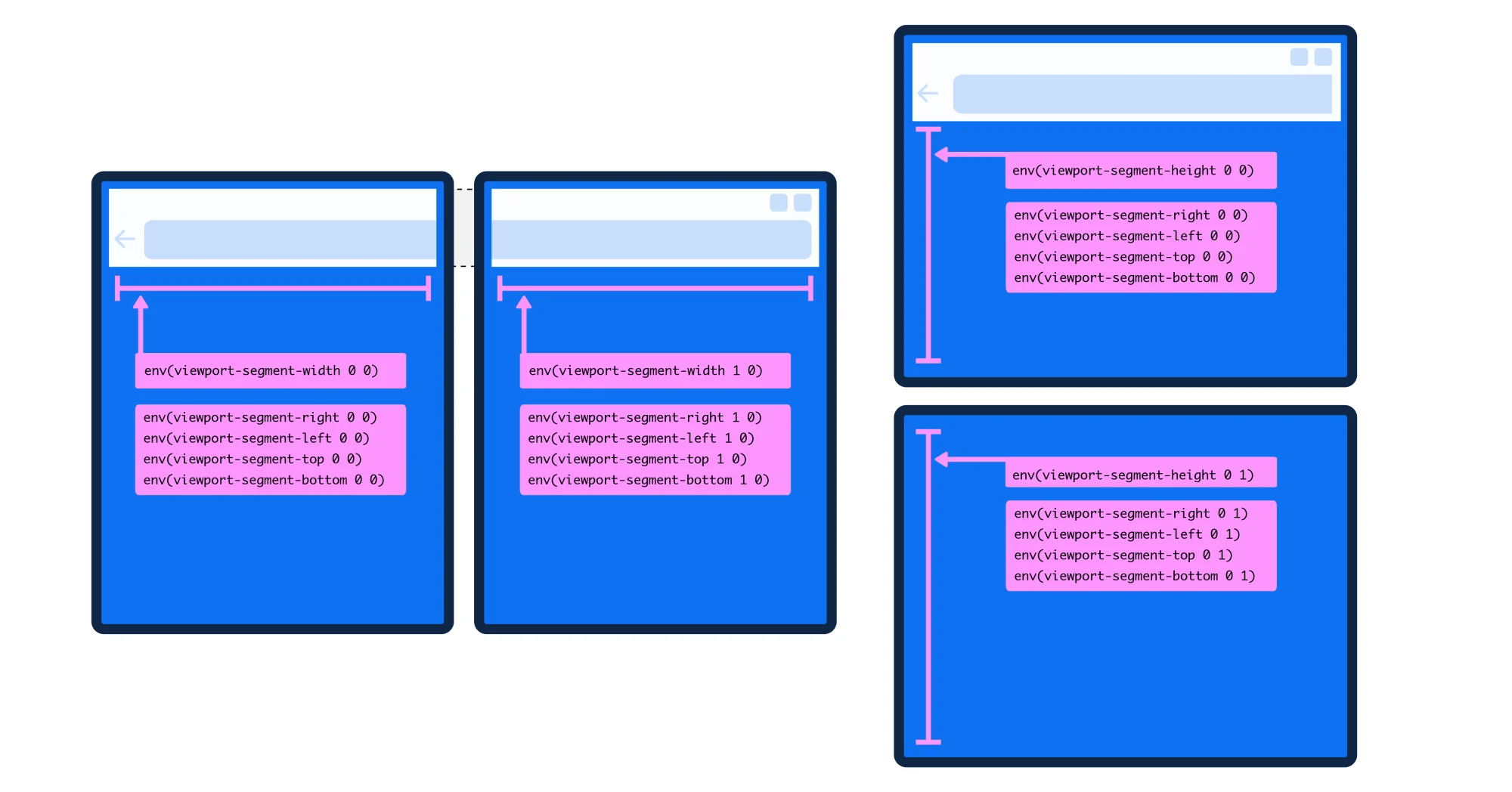
The article introduces six CSS environment variables — viewport-segment-width, height, top, left, bottom, right — that let a layout adapt to each foldable model's specific hinge and screen dimensions without hard-coded breakpoints.
The second feature is a set of CSS environment variables that report the geometry of each screen segment:
env(viewport-segment-width 0 0); env(viewport-segment-height 0 0); env(viewport-segment-top 0 0); env(viewport-segment-left 0 0); env(viewport-segment-bottom 0 0); env(viewport-segment-right 0 0);
The two coordinates address a grid created by the hardware features that separate the segments, with 0,0 at the top-left segment. Because these values are computed by the device, a layout adapts to each model's specific screen and hinge dimensions without a designer writing a separate breakpoint for every device.
Stimac demonstrates the approach on a recipe page that becomes a two-column grid on a dual-screen device:
@media (horizontal-viewport-segments: 2) { .container { grid-template-columns: env(viewport-segment-width 0 0), 1fr; } }
The first grid column fills the left display while the second takes the remaining space on the right. The same rule can be written more explicitly by naming both segment widths, so each column maps to one display.
The environment variables also let a page position content deliberately across the two screens rather than letting it fall across the hinge. In the Smashing Magazine version of this work, Stimac walks through a layout where an early version left text obscured by the device itself; resetting margins and padding, then reapplying them per segment, produced a split layout in which no content is hidden.
A related concern is whether interactive elements land on the seam. The segment geometry is measurable, so a designer can keep buttons and tap targets out of the hinge zone instead of relying on luck — the question is one of deliberate positioning, not a solved hardware problem.
JavaScript offers a parallel path through the Visual Viewport API. Querying `window.visualViewport.segments` returns an array of DOMRects for each segment, or `null` on a single-screen layout — a deliberate design that prevents code from accidentally targeting one-screen devices. The returned values are an immutable snapshot, so after a resize or rotation the page must re-query the segments to get the current state.
The practical question the post raises is not just how to build these layouts, but whether to. Stimac acknowledges the skepticism: many developers see the effort as targeting a sliver of users. Her counterargument rests on a forecast of more than 21 million foldable devices shipped in 2023. That is small next to the overall mobile market, but it is still millions of devices in use — and the arrival of Google's Pixel Fold, she argues, signals that the form factor is persistent rather than experimental.
Her second argument is differentiation: a site that adapts to a foldable does something its competitors' standard responsive layouts do not. She advises using data about which devices customers actually hold before committing engineering time, and notes that the browser in one display pane of the Surface Duo already renders a normal responsive site — so a dual-screen mode is an enhancement, not a requirement.
Browser support is the main obstacle. Both media queries and environment variables are supported in Microsoft Edge Stable. Chrome Stable does not yet ship them, which the post calls a significant gap given that Pixel Fold ships with Chrome. Testing is possible by enabling an experimental flag at `chrome://flags` and using the Surface Duo emulator.
The post closes by noting that without browser and OS support, companies are unlikely to invest in foldable experiences, so the enabling work has to land in browsers first. For readers who want to go deeper, Stimac's longer treatment of the same recipe demo appears on Smashing Magazine, and she recommends downloading Edge to experiment.
What this post establishes is limited in one important way: it is a how-to survey and a point of view, not an independent validation of any of these techniques. The Smashing Magazine piece is written by the same author, so it reflects her own stated position rather than external corroboration. What is not supplied is real-world performance data, adoption figures from any publisher, or any formal evaluation of whether foldable-specific layouts improve measurable outcomes for users.