The proliferation of AI-generated event posters has led to a recognizable visual trend characterized by cluttered layouts, excessive bunting, and a uniform, 'warm' color palette. Critics argue that this 'identikit' style signals a lack of effort and creativity, often resulting in posters that feel soulless or off-putting to potential attendees. This phenomenon is driven by the tendency of large language models (LLMs) to rely on surface-level associations and common training data, which flattens visual hierarchy and makes it difficult for viewers to distinguish important information. To move beyond this default aesthetic, users can explicitly request specific design styles—such as Bauhaus, Swiss Style, or Japanese minimalism—rather than relying on generic prompts. By specifying a clear design framework, users can force the model to adopt a more structured, intentional layout that avoids the 'craft fair' tropes common in automated outputs. While these AI-generated designs may still contain subtle technical errors or lack the nuanced decision-making of a professional human designer, they offer a way to create more distinctive, varied visuals that stand out from the standard, repetitive templates currently dominating local bulletin boards and social media groups.
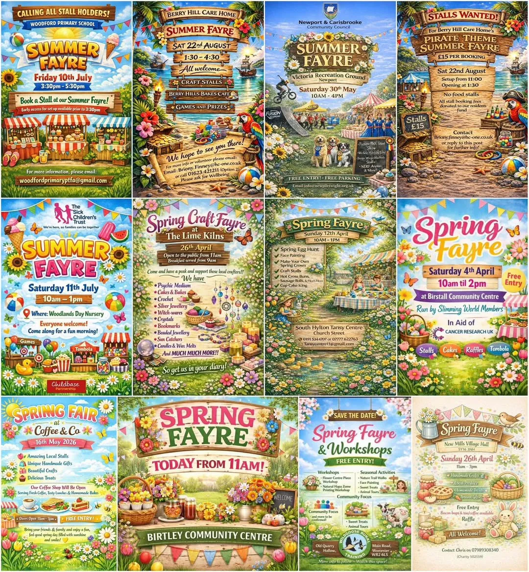
The article highlights how AI models often produce repetitive, cluttered layouts that lack visual hierarchy, as seen in this collage of generic event posters.
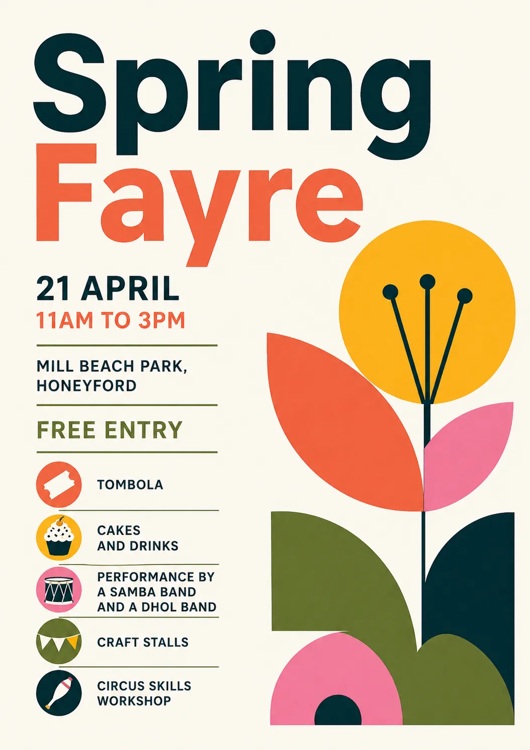
By explicitly requesting established design movements like Bauhaus, users can move away from generic templates and achieve a more structured and intentional visual outcome.